

Build an email layout
An email layout is the email itself: the subject line, the design, and any attachments. The Shopify Flow action picks a layout and a sender, then sends. Because the layout is separate from the workflow, one design can serve every customer without you touching HTML again.
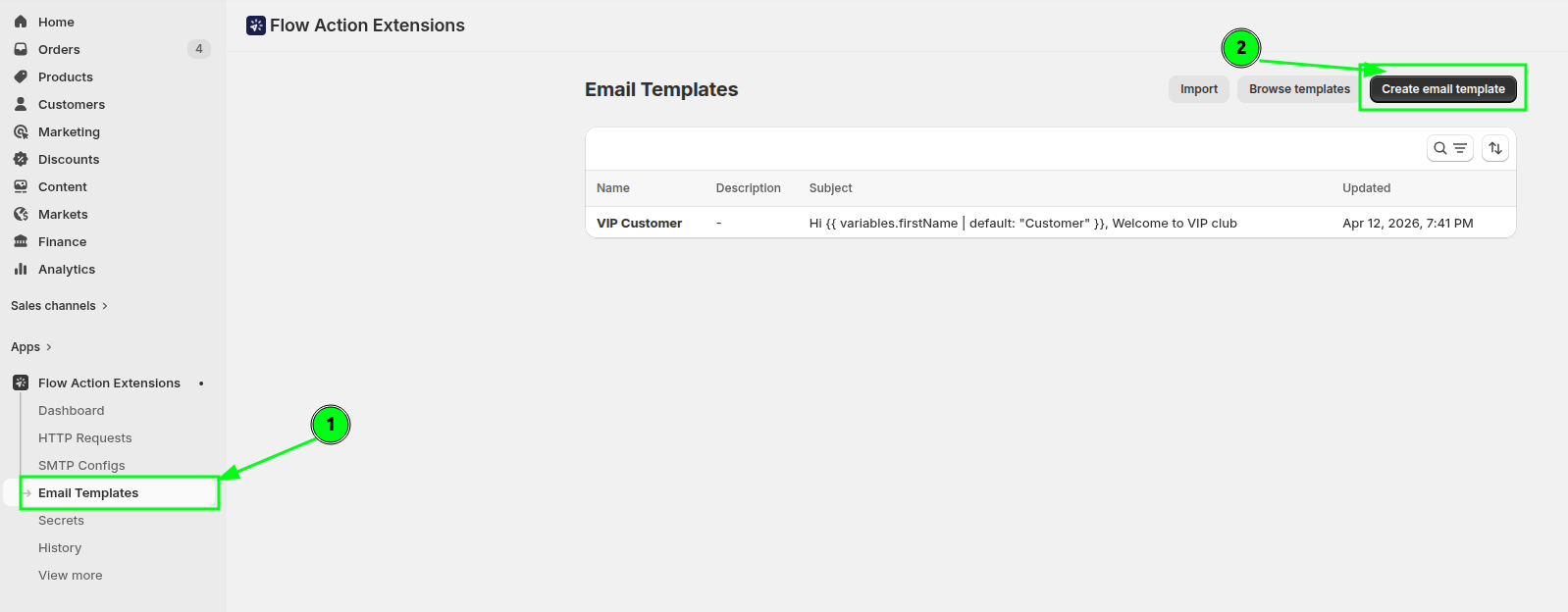
The list has two tabs, Transactional and Marketing, each showing how many layouts it holds. It opens on Transactional, and every layout you created before email types existed is transactional. Your search, sort and page carry over when you switch tabs. A marketing layout carries a Marketing badge next to its name, and Create email layout on the Marketing tab starts the new layout as a marketing one.
Create a layout
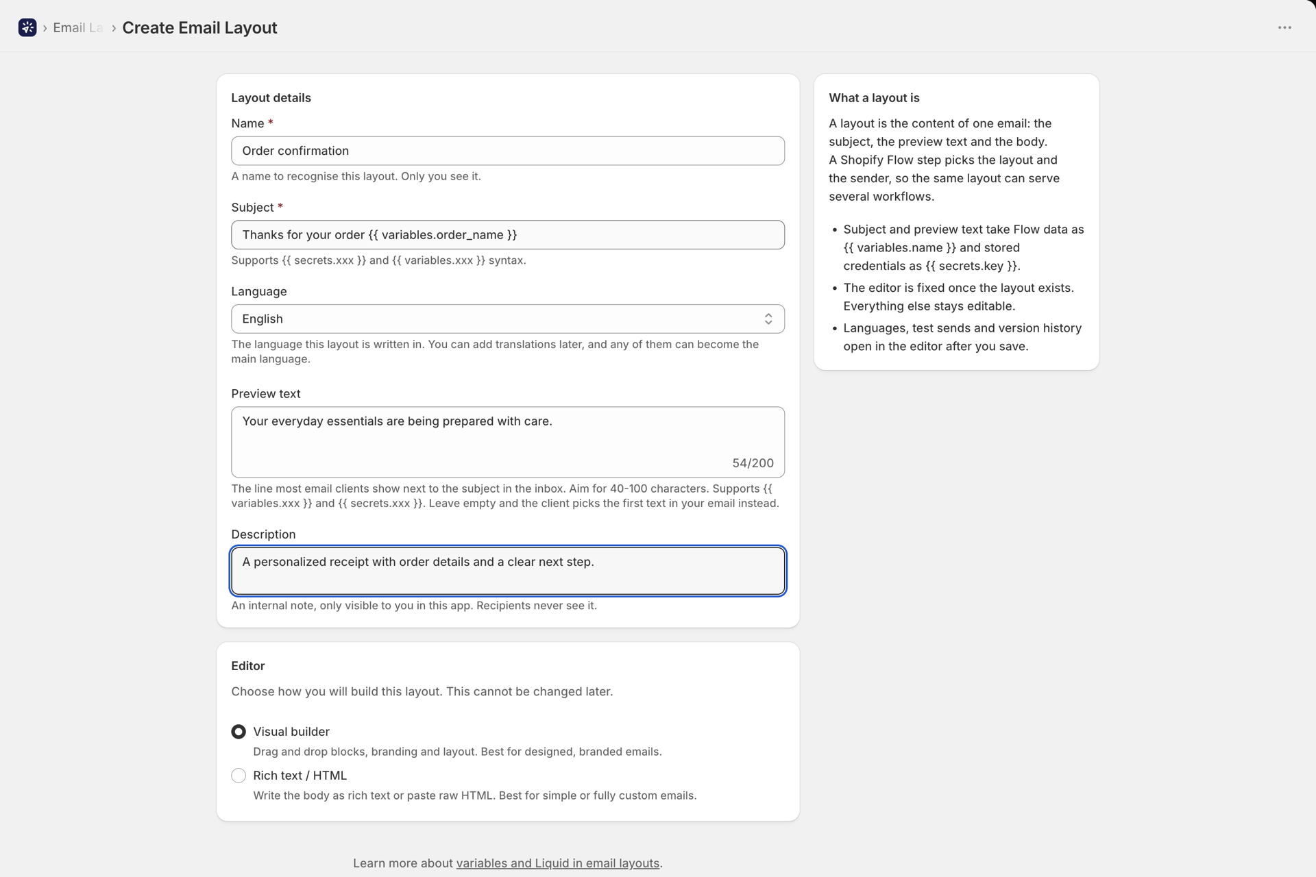
Go to Email Layouts and click Create email layout. You will set:
- Name - how you recognise it. Only you see this.
- Subject - supports
{{ variables.xxx }}and{{ secrets.xxx }}. - Preview text - optional. The short line most inboxes show next to the subject. Aim for 40-100 characters; it supports the same variables as the subject. Leave it empty and the mail client picks the first text in your email instead.
- Description - optional, for your own reference.
- Email type - Transactional for emails customers expect, like order and shipping updates; they are always sent, even to customers who unsubscribed from marketing. Marketing for newsletters, promotions and win-back emails; each recipient gets their own email with an unsubscribe link and your company details from Settings, and customers who unsubscribed are skipped. Unlike the editor, the type can be changed later in the layout editor. Details in Marketing emails and unsubscribes.
Then choose an editor:
| Editor | Best for |
|---|---|
| Visual builder | Designed, branded emails built from drag-and-drop blocks |
| Rich text / HTML | Simple transactional notes, or a fully custom HTML email you paste in |
The visual builder
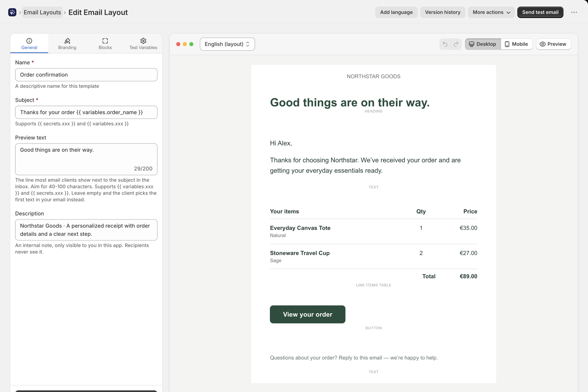
The builder is a two-panel screen: settings on the left, a live canvas preview on the right. Add blocks with the Add section button or the + markers between existing blocks.
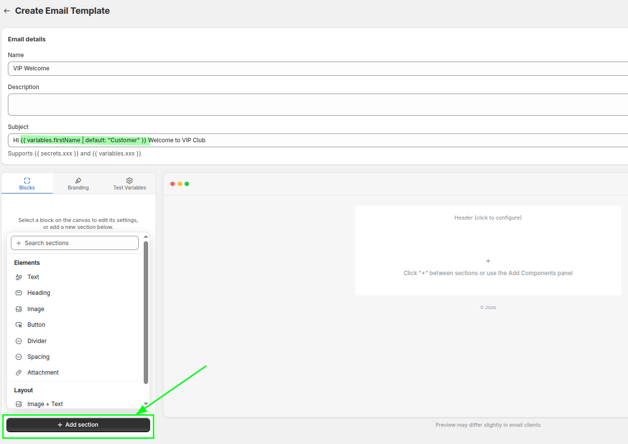
The left panel has four tabs:
| Tab | What it holds |
|---|---|
| General | Name, Subject, Preview text, Description |
| Branding | Colors, typography and layout spacing for the whole email |
| Blocks | Settings for whichever block you selected on the canvas |
| Test Variables | The Shopify Flow JSON snippet, the system variables reference, and sample values for previewing |
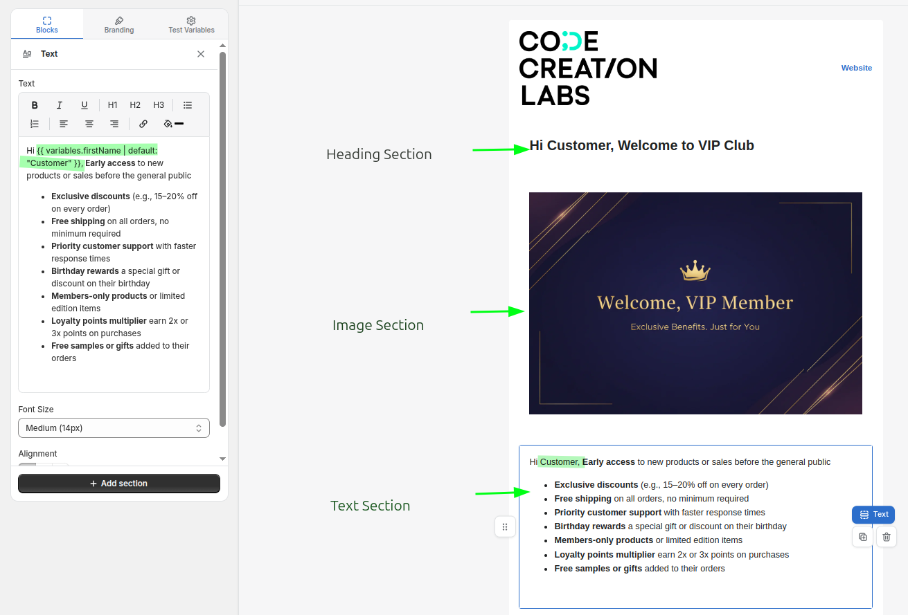
Each block on the canvas has controls to drag it, duplicate it, delete it, or hide it without deleting.
Block reference
Elements
| Block | Settings |
|---|---|
| Text | Rich text, alignment, font size (12/14/16/18), color |
| Heading | Heading text, size (Extra Large H1 to Small H4), alignment, color |
| Image | Image (upload or link), alt text, width 10-100%, alignment |
| Button | Label, URL, style (Primary / Secondary / Outline), alignment, border radius 0-24px |
| Divider | Color, style (Solid / Dashed / Dotted), thickness 1-8 |
| Spacing | Height 4-80px |
| Attachment | File picker and a title. See Attachments and images |
| Loop | Repeats a block of Liquid + HTML over an array variable - use this for line items |
| HTML / Code | Raw HTML with Liquid, including {% if %} conditionals |
| QR Code | Data (URL or text, supports variables), size 80-300px, alignment |
Layout
| Block | Settings |
|---|---|
| Image + Text | Image position (left/right), image width 20-70%, vertical alignment, gap, background color, plus image / text / button sub-components |
| Two Columns | Column split (50/50, 33/67, 67/33, 40/60, 60/40), gap 0-40, vertical alignment, padding, and separate left and right column contents |
Branding
The Branding tab applies to the whole layout:
- Colors - primary, secondary, text, body background, content background
- Typography - heading font, body font, line height
- Layout - the spacing controls below
| Control | What it changes | Range |
|---|---|---|
| Max Width | How wide the email content can grow | 400-800px |
| Container Padding | Space around the whole content area | 0-40px |
| Block Padding (sides) | Space between your content and the left and right edges | 0-40px |
| Block Padding (top & bottom) | Space above and below the content of each block | 0-40px |
| Block Spacing | Vertical gap between one block and the next | 0-40px |
Keep Block Padding (top & bottom) small. Block Spacing already separates blocks, so raising both leaves large gaps.
If you named brand colors under Settings > Brand and fonts, every color picker in the builder shows them as chips under the field, and clicking a chip applies that color. The chip of the color currently in the field is highlighted. See Settings.
The font dropdown offers system fonts (Arial, Georgia, Verdana, Times New Roman, Helvetica, Trebuchet MS), a set of Google fonts (Inter, Roboto, Open Sans, Lato, Montserrat, Poppins, Nunito, Raleway, Playfair Display, Merriweather, Source Sans 3, Oswald, Work Sans, DM Sans, Space Grotesk), and any custom font you uploaded under Settings > Brand and fonts.
Header and footer
The header and footer are clickable regions at the top and bottom of the canvas. Each can use a saved preset so a change to your branding updates every layout at once, or Custom (this layout only) for a one-off. See Header and footer presets.
Rich text / HTML mode
In this mode the body is a single editor with a Rich text / HTML toggle and a separate Preview toggle.
- Rich text gives you a familiar formatting toolbar.
- HTML gives you a raw textarea - paste a fully designed email if you already have one.
- Insert image adds a hosted image, either from your media library or from a link.
The preview is read-only and shows Liquid tags as-is. To see real values, send a test email.
Wiring it to Shopify Flow
A layout is only half the job - Shopify Flow has to supply the values for your placeholders.
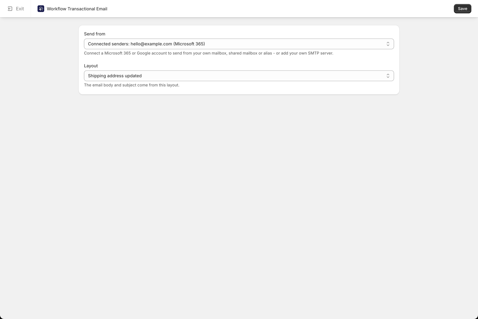
Every layout has a Use in Shopify Flow card containing the exact Variables (JSON) to paste into the Send Transactional Email action, with all key names already correct. Copy it, paste it into Flow, and replace any <pick a Flow variable> placeholders.
Full walkthrough: Passing data from Shopify Flow.
Preview with test variables
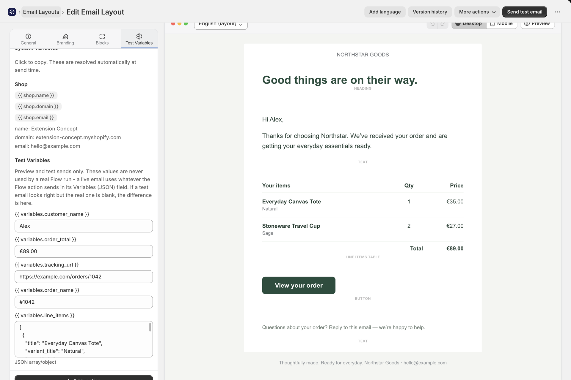
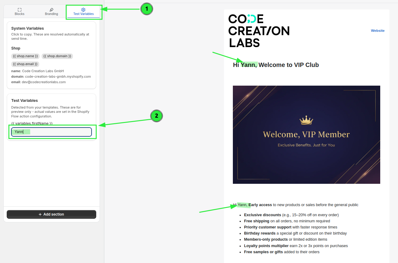
The Test Variables tab lists every {{ variables.x }} the app detected, so you can fill in sample values and see the design render properly.
To feed an array into a Loop block, enter it as a JSON array in this tab.
Send a test email
Use Send test email on the layout editor. It renders the layout for real and sends it through a sender you pick, with the subject prefixed [TEST]. This is the only way to confirm your Liquid actually resolves, since the on-page preview does not evaluate it.
After you go live, check History - a send where a placeholder produced nothing is badged Empty variables. See History and troubleshooting.
Reuse a design
- More → Save as template stores the design so you can start from it again. Saved designs live under My templates, which holds only the designs you saved yourself.
- More → Duplicate copies the layout in place.
- More → Export downloads it, and Import on the list page accepts a
.zipor.jsonpreviously exported from the app - handy for moving a design between stores.
Deleting a layout
You can always delete a layout. If a Shopify Flow step still points at it, the layout carries a Used in Flow badge and the delete confirmation says so - but it does not stop you.
After deleting, any Flow step still referencing it fails with Email template not found, which appears in History. Point those steps at a different layout to fix them.
Related
- Passing data from Shopify Flow - supplying the values.
- Variables and Liquid - the full variable reference.
- Attachments and images - files, images and size limits.
- Header and footer presets - reusable branding.
- Marketing emails and unsubscribes - what a marketing layout does differently.
- Settings - brand colors, custom fonts and shop-wide email defaults.